

Reading a stock chart for the first time can feel intimidating. Lines move up and down, candles change color, and indicators can quickly crowd the screen. However, a stock chart is simply a visual summary of price behavior over time.
For investors, charts can help identify how a stock reacted to past earnings, news, market selloffs, or major company developments. For traders, charts are often used to identify possible entry and exit points. In both cases, learning how to read a stock chart is not about predicting the future with certainty. It is about understanding how price moves, where buyers and sellers have acted before, and how market sentiment is changing.
A stock chart plots price on the vertical axis and time on the horizontal axis. Depending on the chart type, each point, bar, or candle represents trading activity over a selected period, such as one day, one hour, or one minute. Before using chart patterns or indicators, it is important to understand the basic chart types and what they show.
Types of stock charts
There are three common chart types beginners should know: line charts, bar charts, and candlestick charts.
Line chart
A line chart is the simplest stock chart. It usually connects the closing prices of a stock over a selected period with a single line.
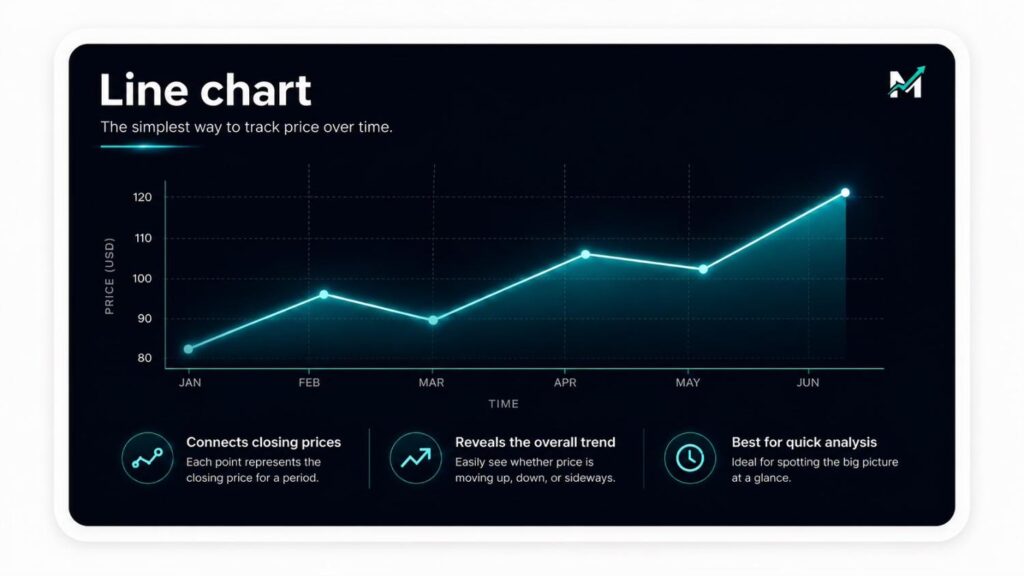
This makes it easy to see the general direction of a stock. If the line moves upward over time, the stock is trending higher. If it moves downward, the stock is trending lower. If it moves sideways, the stock may be trading in a range.
Line charts are useful for quickly assessing long-term trends, but they do not show much detail. They usually do not display the opening price, high, or low for each period. Because of that, they are best used for simple trend analysis rather than detailed trading decisions.
Bar chart
A bar chart shows more information than a line chart. Each bar represents one trading period and displays the open, high, low, and close price.
The vertical line shows the full range between the high and low. A small horizontal mark on the left side shows the opening price. A small horizontal mark on the right side shows the closing price.
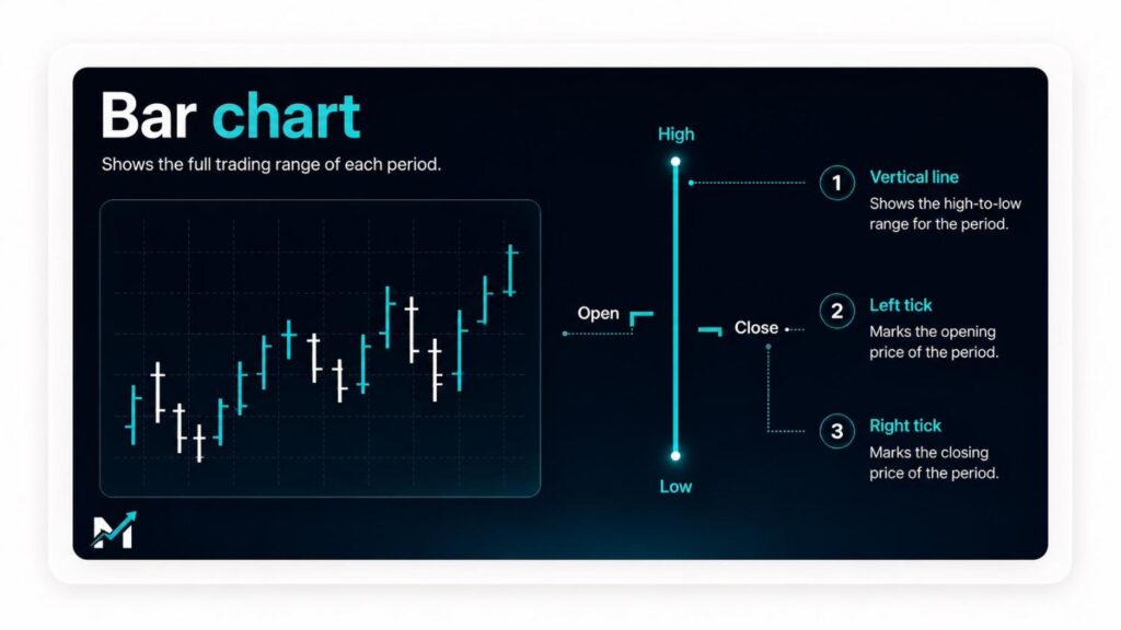
Bar charts are useful because they show volatility. When bars become larger, the stock is moving through a wider price range. This often means volatility is rising. When bars become smaller, price movement is narrowing, which can suggest lower volatility or hesitation among traders.
Candlestick chart
Candlestick charts are among the most popular chart types because they display price action in a clear visual way.
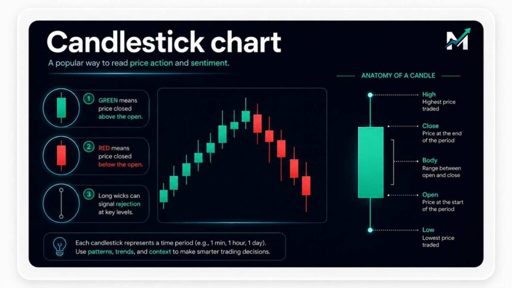
Each candlestick shows the open, high, low, and close for one period. The thick part of the candle is called the body. It shows the range between the opening and closing price. The thin lines above and below the body are called wicks or shadows. They show the highest and lowest prices reached during that period.
A green candle usually means the stock closed higher than it opened. A red candle usually means the stock closed lower than it opened. Large candles can show strong momentum, while small candles can show hesitation. Long upper wicks may show that sellers rejected higher prices, while long lower wicks may show that buyers stepped in after a decline.
Beginners do not need to memorize every candlestick pattern. It is more useful to focus on what the candles are saying about buyer and seller behavior.
How to read a stock chart step by step
Step 1: Choose the chart type
Many beginners start with candlestick charts because they show more detail than line charts while remaining easy to understand. Line charts are better for quick trend checks, while bar charts are useful for seeing the full trading range of each period.
Step 2: Select the timeframe
A daily chart is often a good starting point because each candle or bar represents one full trading day. Shorter timeframes, such as one-minute or five-minute charts, move faster and contain more noise. Weekly or monthly charts are better for seeing the bigger picture.
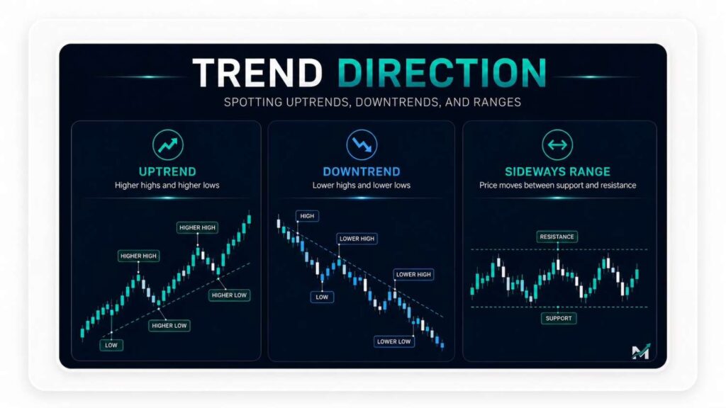
Step 3: Identify the trend
A stock in an uptrend usually makes higher highs and higher lows. This means each rally reaches a higher level than the previous rally, and each pullback holds above the previous low. A stock in a downtrend usually makes lower highs and lower lows. If a stock moves between the same general high and low area, it is trading sideways.
Trend context matters more than one candle or one price move. A single red candle does not necessarily mean a stock is bearish, and a single green candle does not necessarily mean it is bullish. The broader structure is more important.
Step 4: Find support and resistance
Support is an area where a stock repeatedly stops falling and begins to bounce. It acts like a temporary floor. Resistance is an area where a stock repeatedly stops rising and begins to pull back. It acts like a temporary ceiling.
Support and resistance are not exact numbers. They are better viewed as zones where buyers or sellers have previously become active. If a stock falls back toward support, traders watch to see whether buyers step in again. If a stock rises toward resistance, traders watch to see whether sellers return.
Step 5: Look at the volume
Volume shows how many shares traded during a period. A strong price move with high volume is usually more meaningful than a move with low volume because it shows broader participation. For example, if a stock breaks above resistance on strong volume, the breakout may be more convincing. If it breaks above resistance on weak volume, the move may fail.
Step 6: Use indicators carefully
Indicators such as moving averages, relative strength index, and MACD can help add context, but they should not replace price action. Beginners often make charts too complicated by adding too many indicators. A clean chart with price, volume, and perhaps one or two moving averages is usually enough.
Step 7: Zoom out regularly
A stock can look strong on a short-term chart but weak on a longer-term chart. Looking at a higher timeframe can help reduce emotional decisions and show whether a short-term move is part of a larger trend.
Support, resistance, and breakouts
Support and resistance are important because they show where price has reacted before.
If a stock repeatedly bounces near $50, traders may view $50 as support. If it repeatedly struggles near $75, traders may view $75 as resistance. These levels matter because market participants remember them. Buyers may place orders near support, while sellers may take profits near resistance.
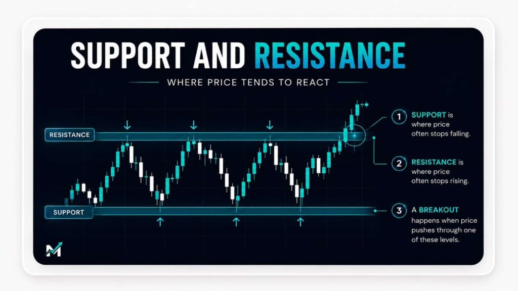
When price moves above resistance, it is called a breakout. When price falls below support, it is called a breakdown. Breakouts and breakdowns can signal that the balance between buyers and sellers has changed.
However, false breakouts happen. A stock may briefly move above resistance and then fall back below it. This is why traders often look for confirmation, such as strong volume or multiple closes above the breakout level.
Moving averages and basic indicators
A moving average smooths price data over a selected period. For example, a 10-day moving average shows the average closing price over the past 10 trading days, while a 30-day moving average shows the average closing price over the past 30 trading days.
Moving averages can help identify trend direction. If the price is above a rising moving average, momentum may be positive. If the price is below a falling moving average, momentum may be negative.
Some traders also watch moving average crossovers. When a shorter-term moving average moves above a longer-term moving average, it can suggest improving momentum. When it falls below a longer-term moving average, it can suggest weakening momentum.
Still, moving averages are based on past prices. They are useful for context, but they should not be treated as guaranteed buy or sell signals.
Common mistakes when reading stock charts
Common mistakes can make stock charts harder to understand than they need to be.
Here are the most common mistakes you should avoid as a beginner:
- Switching timeframes too often: A chart may look bullish on a five-minute timeframe but bearish on a daily chart. Choose one primary timeframe and use higher timeframes only for context.
- Treating charts as prediction tools: Charts do not show exactly what will happen next. They show what has happened and what is happening now.
- Overloading the chart: Too many indicators, trend lines, and patterns can create confusion. Simple charts often lead to clearer analysis.
- Ignoring market context: A stock does not move in isolation. The broader market, sector performance, earnings, interest rates, and news can all affect price.
Final thoughts
Learning how to read a stock chart starts with understanding price behavior. A chart shows how buyers and sellers have interacted over time. By focusing on trend, support and resistance, candlestick behavior, volume, and simple indicators, beginners can build a clearer view of what is happening in a stock.
Charts are not a shortcut to profits, but they are useful tools for structure and discipline. Over time, consistent chart reading can help investors and traders make more informed decisions and avoid emotional reactions.
FAQs
How to read a bar chart stock?
To read a stock bar chart, look at each bar as one trading period. The vertical line shows the high and low price. The small line on the left shows the opening price, while the small line on the right shows the closing price. Longer bars show greater volatility, while shorter bars show tighter price movement.
How to read a chart in the stock market?
To read a stock market chart, start by choosing a timeframe. Then identify the trend, mark support and resistance, and check volume to confirm whether price moves have strong participation. Beginners should focus on price action first and use indicators only for added context.
How to read a candle chart for stocks?
To read a candle chart, look at the candle body and wicks. The body shows the difference between the open and close. The wicks show the high and low. Green candles usually mean prices closed higher than they opened, while red candles usually mean prices closed lower. Candles are most useful when read together with trend, support, resistance, and volume.
Photo by Jakub Żerdzicki on Unsplash